Every breathtaking oil or acrylic painting you see in a gallery—whether a luminous landscape by an Hudson River School master or a striking modern portrait—represents only the tip of an iceberg.
What the public sees is the final layer of creamy, vibrant brushstrokes. What they never see are the invisible hours of disciplined studio preparation that took place before the first stroke of color ever touched the canvas.
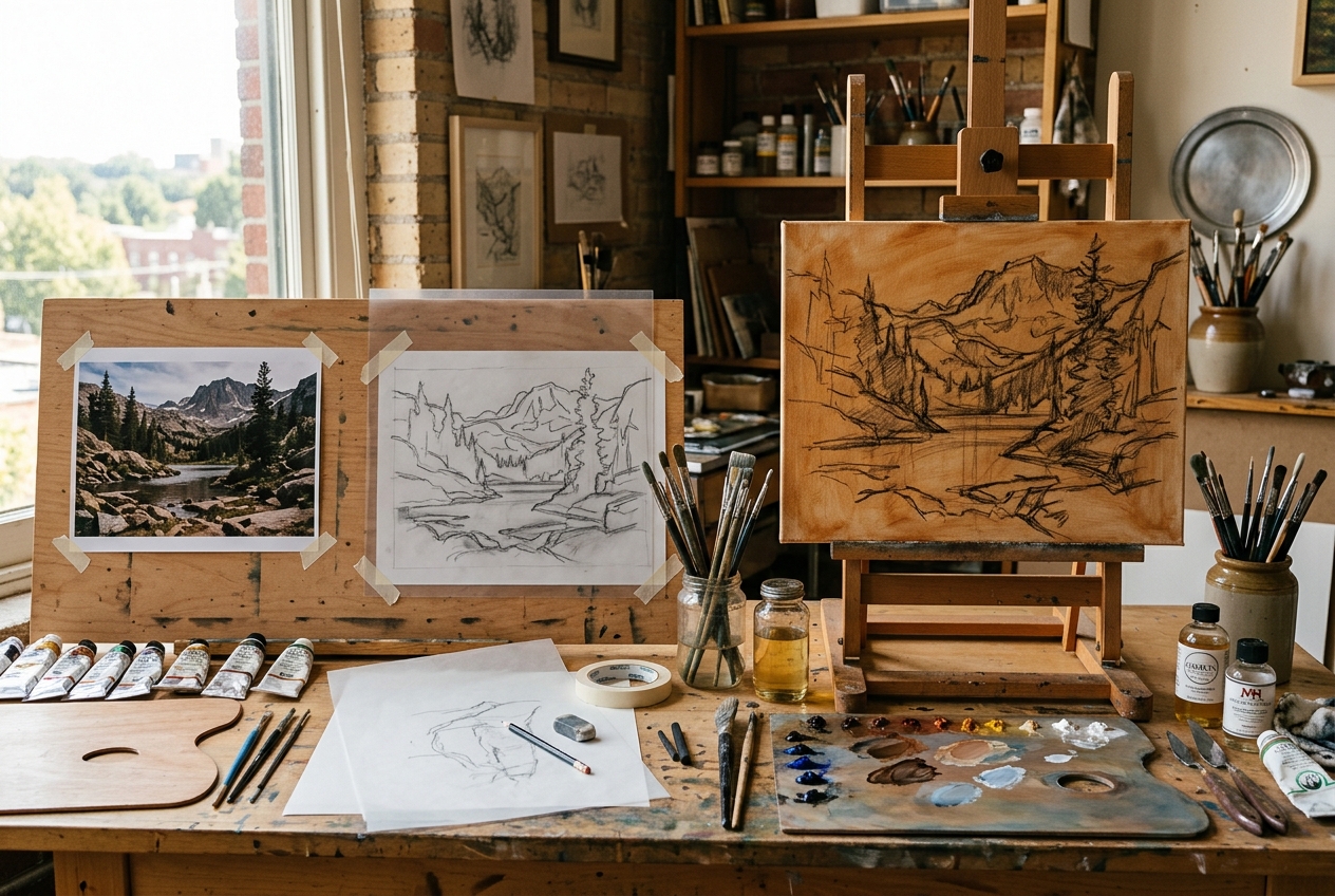
Many beginner and self-taught artists make the understandable mistake of treating painting like an impromptu sprint: they buy a raw white canvas, tape up a small phone photo on the wall, squeeze out paint, and immediately try to render fine details. Two hours later, the drawing is skewed, the colors are muddy, the white canvas creates glare, and frustration sets in.
In classical ateliers, painting is approached not as an impulsive gamble, but as a calm, systematic 4-stage pipeline:
Stage 1: Palette Architecture (Color & Mood Planning)
Stage 2: Contour Simplification (Line Art Extraction)
Stage 3: Proportional Scaling (The Grid Transfer)
Stage 4: Ground Toning & Imprimatura Block-In (Value Anchoring)
By dividing the preparation into discrete, manageable steps, you eliminate anxiety, preserve your artistic energy for creative expression, and guarantee that your final piece has rock-solid foundations.
Here is the complete step-by-step studio workflow used by professional painters today.
Stage 1: Palette Architecture — Planning Colors Before Squeezing Tubes
The first mistake occurs before paint ever leaves the tube: failing to plan the chromatic structure of the painting.
When you look at a photograph, your eyes are overwhelmed by millions of variations in hue and exposure. If you attempt to match every color on the fly, you will quickly lose control of your palette.
The 3-Step Palette Planning Routine
1. Identify the Light Source Temperature: Is the scene lit by warm golden sunlight (calling for cool, blue-violet shadows) or cool overcast daylight (calling for warm, earthy shadows)?
2. Extract the Core 5-Color Harmonies: Use Pintado’s Color Mixer & Palette Generator to analyze your reference photo. Run the automated clustering algorithm to isolate the 5 dominant hues:
– Sky / Mother Light
– Warm Midtone Accent
– Dominant Shadow Mass
– Foliage / Local Color
– Neutral Deep Accent
3. Pre-Mix Value Strings: On your palette, pre-mix 3 values (Light, Midtone, Dark) of your two most critical mixtures before you pick up a brush. Having your value strings ready prevents frantic color-searching while your canvas is wet.
Reference Photo ──► Extract 5 Core Colors ──► Mix Value Strings (Light/Mid/Dark) ──► Ready PaletteStage 2: Contour Simplification — Transforming Photo into Line Art
A photograph contains continuous gradations of tone and subtle textures. However, when transferring your composition to a canvas, you do not want textures; you want clean structural silhouettes.
If you attempt to trace directly from a photographic printout over a light box, you will get lost in skin pores, leaves, and soft shadow falloffs.
Isolating Pure Contour Edges
To prepare your template:
1. Load your reference into Pintado’s Photo to Coloring Page Converter.
2. Adjust the Line Thickness slider to 2px for a fine outline.
3. Push the Paper Cleanliness slider upward to eliminate photographic film grain and shadow blur.
4. Export the clean black-and-white contour outline as a high-resolution PNG or print it out at 100% scale.
Now you have a crisp blueprint that clearly separates key anatomy, horizon lines, and major shadow boundaries.
Stage 3: Proportional Scaling — Choosing Your Transfer Method
Now that you have your contour outline, how do you scale it accurately onto your working canvas?
Depending on your canvas size and artistic goals, choose one of the three established studio transfer methods:
| Method | Best Canvas Size | Accuracy | Prep Time | Equipment Needed |
|---|---|---|---|---|
| A. The Proportional Grid Method | Medium to Large (16×20″ to 36×48″) | High | 15–20 mins | Ruler, 2H pencil, Grid Calculator |
| B. Graphite Transfer Paper | Small to Medium (8×10″ to 12×16″) | Exact (1:1) | 5 mins | Printed line art, wax-free graphite paper, stylus |
| C. Digital Projector | Extra Large Murals / Rapid Production | Exact | 5 mins | Mini digital projector, tripod, darkened studio |
### Executing the Grid Method with Confidence
If working on a large canvas where 1:1 printing is impractical, the **Grid Method** is king:
1. Open Pintado’s [Grid Method Calculator](https://pintado.org/tools/grid-method-calculator/) and set your desired square spacing (e.g., 6×8 boxes).
2. Toggle on **”Atelier Sight Diagonals”** to add corner-to-corner vectors.
3. Measure and pencil identical grid divisions lightly onto your canvas with a hard **3H pencil** or thin vine charcoal.
4. Transfer the contour lines box by box, paying special attention to where lines enter and exit each cell boundary.
5. Roll a kneaded eraser over the canvas to soften the grid lines until they are barely perceptible.
Stage 4: Ground Toning & Imprimatura — Banishing the Scary White Canvas
Here is a universal secret of oil and acrylic masters: never paint on a blinding white canvas.
A bright white surface deceives your brain’s perception of value:
– A dark tone placed on pure white looks twice as dark as it actually is.
– A light highlight placed on pure white looks invisible.
– The stark glare causes visual eye fatigue within thirty minutes.
The classical remedy is Imprimatura (Italian for “first coat”): applying a thin, luminous, neutral tone across the entire canvas before painting.
Raw White Canvas  ──►  Imprimatura Wash  ──►  Wipe Away Highlights  ──►  Warm Harmonized Ground
[Blinding Glare]       [Burnt Sienna Wash]    [Rag / Q-tip / Eraser]     [Perfect Tonal Baseline]
How to Apply a Classic Warm Imprimatura
1. In a small jar or cup, mix Burnt Sienna (or Raw Umber) with odorless mineral spirits (or acrylic glazing liquid if working in acrylics) until it has the thin consistency of tea.
2. Using a large 2-inch utility brush or flat wash brush, scrub the warm wash quickly across the entire canvas.
3. Take a clean cotton shop rag or blue paper towel and buff the surface evenly. You should be left with a smooth, warm golden-amber veil through which your subtle grid or contour sketch is still visible.
4. The “Wipe-Out” Technique: While the imprimatura is still wet (in oils), take a small piece of rag wrapped around your finger, dip it in solvent, and wipe away the paint where your brightest highlights will be (e.g., the forehead, nose tip, glint on water). You have now created a luminous two-tone tonal map in less than five minutes!
Summary Comparison: Impromptu Painting vs. The 4-Stage Workflow
| Studio Dimension | The “Jump Right In” Impromptu Approach | The 4-Stage Atelier Pipeline |
|---|---|---|
| Drawing Accuracy | Frequent proportion skewing; facial features drift out of alignment | 100% anatomical fidelity via verified grid coordinates |
| Color Control | Muddy mixtures from guessing tube interactions | Controlled harmony anchored by pre-extracted 5-color palette |
| Value Judgment | Fooled by blinding white canvas glare | Clear, accurate values anchored on warm imprimatura |
| Stress Level | High anxiety; constantly erasing and repainting errors | Relaxed, confident, meditative flow state |
| Finish Rate | Many abandoned canvases in the closet | High completion rate of gallery-worthy paintings |
—
Studio Safety and Materials Longevity Checklist
Before you start laying in your opaque paint, run through this quick atelier checklist to ensure your painting lasts for generations:
- [ ] Surface Sizing: Ensure your canvas is double-primed with acrylic gesso to prevent paint oils from rotting the linen or cotton fibers.
- [ ] “Fat Over Lean” Rule (Oils): Ensure your preliminary underpainting uses minimal oil medium (thinned with solvent). As you build successive layers, gradually increase the oil content.
- [ ] Fixing Charcoal Lines: If you transferred your contour drawing using vine charcoal, give the canvas a quick mist of workable matte fixative (or a light wash of diluted shellac) so dark charcoal powder doesn’t dirty your light paint layers.
- [ ] Palette Ergonomics: Position your palette at the exact same height and angle as your canvas so you can glance between the two without twisting your neck.
Frequently Asked Questions (FAQ)
How long does an oil imprimatura take to dry?
If mixed with fast-drying earth pigments like Burnt Sienna or Raw Umber and thinned with mineral spirits (Gamsol), a thin wipe-out imprimatura is typically dry to the touch within 12 to 24 hours. If you want to paint immediately the same afternoon, use acrylic paint for your imprimatura (it dries in 10 minutes), then paint oil over top (the “acrylic under oil” rule is fully archival).
Can I use watercolor over an imprimatura?
No. Watercolor relies entirely on the white paper reflecting light back through transparent layers. For watercolor, you keep the paper white, but you use Pintado’s Photo to Coloring Page Converter to transfer delicate graphite contour lines via a light box.
Does prepping like this take away the artistic spontaneity?
Quite the opposite! Spontaneity works best when you aren’t terrified of ruining your drawing. Because your proportions and value structure are secured during prep, you can be wildly expressive, loose, and brave with your brushwork without fear of losing the likeness.
Conclusion: Elevate Your Studio Craft
Great painting is built on great foundations. When you separate the cognitive load of color harmony, drawing proportions, and painting technique into sequential steps, every session in your studio becomes a calm, deeply rewarding pleasure.
Take advantage of Pintado’s free digital tools to power your prep:
1. Extract your palette with the Color Mixer & Palette Generator.
2. Convert your reference into line art with the Photo to Coloring Page Converter.
3. Scale your reference effortlessly with the Grid Method Calculator.
Set up your easel, prepare your ground, and enjoy the confidence that comes from master-level studio preparation.