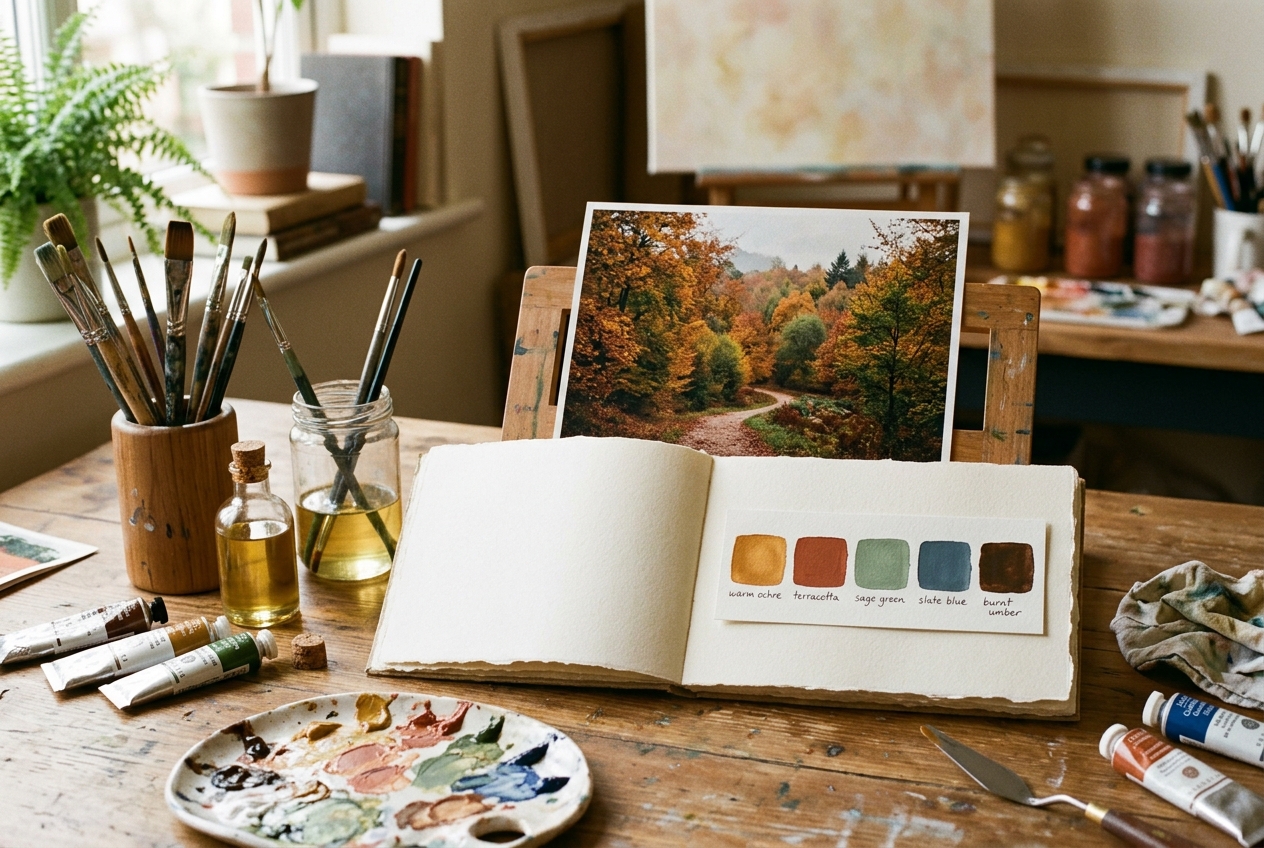
Walk into any art supply store, and you will be confronted by hundreds of dazzling paint tubes: Cadmium Orange, Cobalt Teal, Quinacridone Magenta, Manganese Violet, Raw Sienna, Naples Yellow, and dozens more. For beginners and experienced painters alike, the temptation to buy every tube on the shelf is almost irresistible.
Yet, when artists bring twenty different colors back to the studio and squeeze them all onto a palette, something disappointing usually happens: their paintings end up looking chaotic, disjointed, and visually jarring.
The world’s greatest painters—from Rembrandt and Anders Zorn to John Singer Sargent and modern plein air masters—rarely used more than four to six colors in a single artwork. They relied on limited color palettes.
A limited palette guarantees automatic color harmony. Because every mixture on your canvas is born from the same small family of pigments, your painting sings with an organic unity that an uncontrolled palette of twenty tubes can never match.
In this guide, you will learn the theory behind limited palettes, how to extract a cohesive 5-to-6 color gamut from any landscape or portrait photograph, and how to mix every required shade with precision.
1. The Paradox of Choice in Painting: Why Less Is More
In psychology, the “Paradox of Choice” states that having too many options leads to decision fatigue, hesitation, and poor outcomes. In painting, this holds true tenfold.
When you have twenty tubes on your palette:
– You spend 70% of your painting time wondering which tube to pick next.
– You create chromatic clashes because synthetic pigments with incompatible chemical undertones fight for dominance.
– You struggle to judge tonal values accurately because intense chroma distracts your eye.
When you restrict yourself to 4 to 6 core pigments:
1. Effortless Color Harmony: Every color on the canvas shares common DNA. Your shadows naturally harmonize with your highlights.
2. Lightning-Fast Decisions: Instead of wondering “Which green tube should I buy?”, you ask “Do I need this green warmer or cooler, lighter or darker?”
3. Mastery of Tonal Value: You begin seeing colors in terms of their grayscale value rather than their superficial hue, which is the true secret to depth and three-dimensional form.
20 Tubes on Palette  ──► Decision Paralysis ──► Incompatible Pigment Biases ──► Visual Clutter
4-6 Curated Tubes    ──► Fast Intuition     ──► Shared Pigment DNA           ──► Unified Harmony
2. Classical Limited Palettes: The Zorn Palette Legacy
The most famous limited palette in art history was championed by Swedish master portraitist Anders Zorn (1860–1920).
Zorn’s palette consisted of just four colors:
1. Ivory Black (acting as your dark neutral and cool blue)
2. Titanium or Flake White (acting as your light value modifier)
3. Yellow Ochre (acting as your primary yellow)
4. Cadmium Red or Vermilion (acting as your primary red)
[ Titanium White ] (Value Tint)
               ▲
               │
[ Ivory Black ]┼───[ Cadmium Red ]
  (Cool/Dark)  │      (Warm/Chroma)
               ▼
       [ Yellow Ochre ] (Earth Midtone)
At first glance, you might ask: “Where is the blue? How did Zorn paint skin tones, fabrics, and atmospheric shadows with no blue?”
Because Ivory Black is made from charred animal bones (carbon), it has a distinctly cool, bluish undertone. When you mix Ivory Black with Titanium White and Yellow Ochre, it produces subtle, shimmering olive-greens, slate grays, and silvery blues.
By mastering just four colors, Zorn created luminous flesh tones and museum masterpieces that still captivate millions today.
3. How to Extract a 5-Color Palette from Any Reference Photo
Modern landscapes, sunsets, and botanicals often require hues outside the Zorn palette—such as lush greens or vibrant skylines.
To create a tailored limited palette for your specific subject, follow the Median-Cut Color Quantization workflow:
The 5 Essential Roles in Every Limited Palette
When analyzing any reference photo, do not try to match every single pixel. Instead, look for five functional roles:
| Palette Role | Studio Purpose | Landscape Example | Portrait Example |
|---|---|---|---|
| 1. The Dominant Mother Hue | Sets the overarching atmospheric mood | Ultramarine Blue (sky/water) | Yellow Ochre (skin undertone) |
| 2. The Temperature Counterweight | Balances the mother hue with opposing warmth/coolness | Burnt Sienna (warm earth) | Alizarin Crimson (flushed cheeks) |
| 3. The High-Chroma Anchor | Reserved for focal point highlights | Cadmium Yellow Pale (sunlight) | Cadmium Red (lips/accents) |
| 4. The Deep Value Anchor | Anchors the lowest values in your shadow structure | Raw Umber or Burnt Umber | Ivory Black or Paynes Gray |
| 5. The Opaque Value Modifier | Controls lightness and opacity across all mixes | Titanium White | Titanium-Zinc White |
### Automated Photo Extraction with Pintado
Rather than guessing hex codes or squinting at a photo on your phone, you can automate this extraction inside Pintado:
- Open Pintado’s Free Color Mixer & Palette Generator.
- Drop your reference photo into the canvas.
- The tool runs a client-side Median-Cut clustering algorithm, grouping millions of photograph pixels into the 6 most harmonically dominant color clusters.
- You get an instant, downloadable swatch card showing the exact RGB, HEX, and estimated pigment matches (e.g., Sap Green, Burnt Sienna, Prussian Blue).
4. Converting Extracted Digital Swatches into Real Paint Tubes
A common pitfall occurs when digital swatches are taken literally. A photo might extract a pixel that reads #3B4A3F. A beginner might think: “I don’t have that tube!”
Remember: you do not buy the swatches; you mix them from basic primaries.
Here is a foolproof conversion guide from extracted nature hues to standard physical paint tubes:
Extracted Warm Olive    ──► 60% Yellow Ochre + 30% Ultramarine Blue + 10% White
Extracted Sunset Coral  ──► 70% Cadmium Yellow Medium + 25% Cadmium Red + 5% White
Extracted Pine Shadow   ──► 80% Ultramarine Blue + 20% Burnt Umber (velvety near-black)
Extracted Mist Sky      ──► 85% Titanium White + 10% Cobalt/Ultramarine + 5% Raw Umber
5. Studio Exercise: The “Mother Color” Harmony Technique
If you want to guarantee that your painting has an atmospheric glow like a masterwork, try the Mother Color Technique:
- Lay out your 4 to 5 chosen palette tubes.
- Mix a nickel-sized pile of what you consider the single most dominant mood color of the scene (e.g., in a golden hour sunset, mix a warm, luminous yellow-amber). This is your Mother Color.
- Now, before painting, take a tiny pea-sized touch of this Mother Color and blend it into every other pile of paint on your palette—into your blues, your greens, your browns, and your whites.
By lacing every mixture with a fraction of that golden mother hue, you simulate the physical law of ambient illumination: in a room lit by warm candlelight, every single shadow and highlight is bathed in warm light. Your painting will instantly cohere with cinematic unity.
6. Three Proven Limited Palette Formulas for Different Genres
Formula A: The Atmospheric Plein Air Landscape
– Ultramarine Blue (PB29) — Cool, deep blue for skies and shadows
– Cadmium Yellow Light (PY35) — Bright, acidic yellow for sunlit leaves
– Yellow Ochre (PY42) — Muted earth yellow for grasses and ground planes
– Burnt Sienna (PR101) — Warm earth red for tree bark and neutralizing blue
– Titanium White (PW6) — Opaque white
Formula B: The Moody Coastal Marine
– Prussian Blue (PB27) — Deep cyan-blue for crashing waves and stormy skies
– Raw Umber (PBr7) — Cool, fast-drying dark brown for wet rocks and seaweed
– Burnt Sienna (PR101) — Warm counterweight for rust, driftwood, and sandy cliffs
– Titanium White (PW6) — Foam and spray highlights
Formula C: The Classical Portrait
– Yellow Ochre (PY42) — Primary warm light on skin
– Cadmium Red Medium (PR108) — Blood flow in ears, cheeks, lips, and nostrils
– Ivory Black (PBk9) — Hair shadows, pupil depth, and cool gray transitions
– Flake White Alternative / Titanium White (PW6) — Forehead, nose, and cheek highlights
Frequently Asked Questions (FAQ)
What if I need a bright color that my limited palette cannot mix?
Reserve that bright color as a “Special Guest”. Keep your painting 95% governed by your limited palette. Then, right at the end of the painting, introduce one pure, high-chroma accent (like a dot of pure Vermilion on a boat buoy, or a splash of Cerulean Blue on a bird’s wing). Because the rest of the canvas is unified and muted, that single vibrant accent will pop with astonishing visual power.
Why do my colors look dead when I use black?
Carbon or Lamp Black can look cold and greasy if used incorrectly. Instead of using pure black to darken colors, mix your own chromatic black: combine Ultramarine Blue + Burnt Umber in equal parts. This creates a deep, transparent, velvety black that feels rich and full of light.
Can I use limited palettes in watercolor?
Yes, limited palettes are especially powerful in watercolor! Because watercolor relies on transparent optical layering (glazes), having too many different chemical pigments causes the layers to look muddy and dull. Sticking to 3 to 4 single-pigment transparent colors yields sparkling, glass-like transparency.
Conclusion: Free Your Mind by Limiting Your Palette
Limiting your colors is not a constraint; it is a creative liberation. When you stop worrying about which tube to grab from a pile of thirty, your attention shifts to where it truly belongs: expressive brushwork, confident tonal values, and storytelling.
Before your next painting session, take your reference photo to Pintado’s Free Color Mixer & Palette Generator. Extract your custom 5-color palette card, lay out only those tubes on your workbench, and watch your artwork achieve a level of elegance you never thought possible.