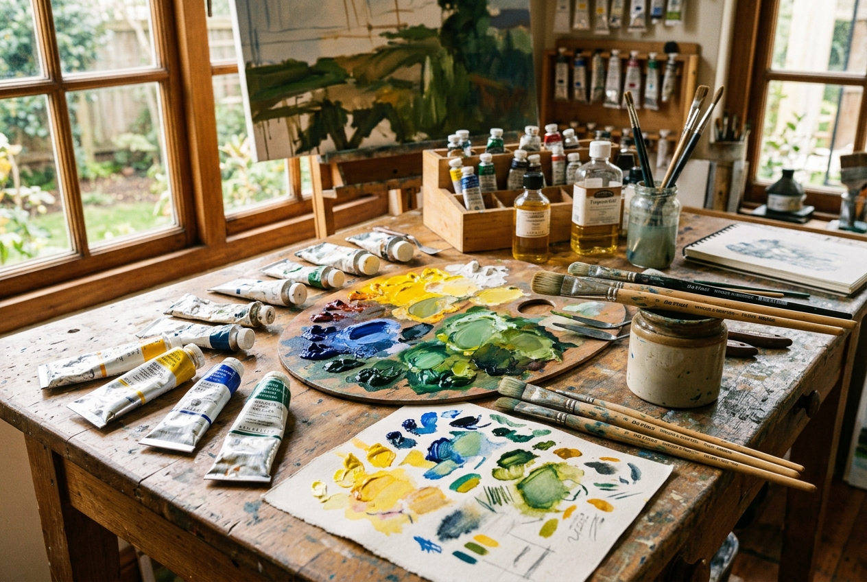
Every painter remembers the first time they squeezed out a tube of factory-made “Sap Green” or “Viridian,” brushed it across a canvas, and realized with dismay that it looked completely artificial. Foliage in nature rarely looks like it was extruded from a plastic bottle. Real leaves, moss, pine needles, and sunlit meadows contain subtle, vibrating shifts in temperature, value, and chroma that ready-made tube greens simply cannot capture.
The secret known to classical atelier masters and modern landscape painters alike is simple: the most believable greens are mixed on the palette from basic primaries.
Among all primary combinations, the pairing of Ultramarine Blue and Cadmium Yellow is the workhorse of the painting studio. Yet many beginner and intermediate painters struggle when combining them—producing murky olive drabs when they wanted vibrant spring lime, or dull sludge when they needed deep forest shadows.
In this guide, we will unpack the exact physics of subtractive pigment mixing, break down warm versus cool pigment temperatures, and give you precise mixing formulas to achieve luminous, lifelike greens in oils, acrylics, and watercolors.
1. Why Mixing Yellow and Blue Makes Green: Subtractive Color Science
Before touching your brush to a palette, it helps to understand why pigments behave differently from computer screens.
Additive vs. Subtractive Mixing
When you look at a digital monitor, you are seeing additive color (RGB). Light is projected directly toward your eyes. When red, green, and blue light waves converge at full strength, they produce white light.
Paint, however, works through subtractive color physics (RYB):
1. White ambient light hits the canvas or palette surface.
2. The microscopic pigment particles absorb (subtract) certain wavelengths of light.
3. The remaining wavelengths bounce off the surface and enter your eyes as perceived color.
White Daylight  ───►  [Yellow Pigment]  ───►  Absorbs Violet & Blue Wavelengths
White Daylight  ───►  [Blue Pigment]    ───►  Absorbs Red & Orange Wavelengths
Remaining Reflected Wavelength: GREEN (510–550 nm)
When you mix Cadmium Yellow (which reflects yellow, orange, and green light while absorbing violet) with Ultramarine Blue (which reflects blue, violet, and green while absorbing orange and yellow), the only visible wavelength that neither pigment fully absorbs is green.
💡 Digital Studio Tip: Trying to predict physical paint mixtures on standard RGB digital software usually leads to frustration because digital apps average pixels additively, often turning yellow + blue into a lifeless gray. If you want to test paint mixes before squeezing expensive tubes, use Pintado’s Subtractive Color Mixer, which is calibrated specifically on subtractive RYB pigment mathematics.
2. Understanding Pigment Bias: Warm vs. Cool Primaries
The most common reason painters end up with “muddy” green is ignoring pigment bias.
In painting theory, no primary tube is 100% pure; each leans slightly toward its neighbor on the color wheel:
– A warm blue leans toward red (e.g., French Ultramarine).
– A cool blue leans toward yellow/green (e.g., Phthalo Blue, Cerulean).
– A warm yellow leans toward red/orange (e.g., Cadmium Yellow Deep, Indian Yellow).
– A cool yellow leans toward blue/green (e.g., Cadmium Yellow Light, Lemon Yellow, Bismuth Vanadate).
The “Tertiary Mud Rule”
Whenever you inadvertently introduce all three primaries (Yellow + Blue + Red) into a mixture, you create a tertiary shade—which pulls the color toward neutral gray or brown.
Take a close look at Ultramarine Blue:
– Chemical formula: Complex sodium aluminum silicate with sulfur (PB29).
– Underlying bias: It contains a strong red-violet undertone. Because red is the complementary opposite of green, that hint of red actively desaturates the resulting mixture.
This does not make Ultramarine bad for greens! In fact, it makes Ultramarine the supreme choice for natural, realistic earth greens, because raw nature is almost never neon. If you want tropical neon greens, you would choose Phthalo Blue and Lemon Yellow; but for landscapes, gardens, and botanical studies, Ultramarine + Cadmium Yellow provides an unmatched organic realism.
3. The 4 Fundamental Green Recipes with Ultramarine & Cadmium Yellow
By adjusting the proportions and introducing just one tint or shade modifier, you can produce the entire gamut of a summer forest.
| Green Type | Base Mixture | Modifiers | Best Used For |
|---|---|---|---|
| Juicy Meadow Green | 70% Cadmium Yellow Medium + 30% Ultramarine Blue | + Pinch of Titanium White | Sunlit grass, spring foliage, young birch leaves |
| Deep Forest Pine | 75% Ultramarine Blue + 25% Cadmium Yellow Medium | None (or + touch of Burnt Sienna) | Evergreen needles, dense canopy shadows, distant mountain conifers |
| Warm Olive & Moss | 50% Cadmium Yellow Deep + 50% Ultramarine Blue | + Touch of Raw Umber | River rocks, tree bark lichen, dried autumn grasses |
| Atmospheric Distance Green | 40% Ultramarine Blue + 20% Cadmium Yellow Light | + 40% Titanium White | Distant tree lines, aerial perspective, haze |
### Recipe 1: Luminous Sunlit Leaf Green
1. Start with a dime-sized dollop of **Cadmium Yellow Medium** on your palette.
2. Using the edge of your palette knife, introduce a needle-head amount of **Ultramarine Blue**. Always mix dark into light—blue is much stronger in tinting strength than yellow!
3. Blend until uniform. The result is a vibrant, organic mid-green.
4. To mimic translucent sunlight shining through a leaf, add a speck of **Titanium White** and a touch more Yellow.
Recipe 2: Deep Woodland Shadow Green
1. Place a dollop of Ultramarine Blue on the palette.
2. Mix in 25% Cadmium Yellow. Notice how deep and brooding the green appears.
3. If it looks too bright or chalky for an interior shadow, fold in a tiny speck of Burnt Sienna (PR101). Because Burnt Sienna is a warm earth red-orange, it neutralizes the chroma without turning the green black, creating a velvety, breathable woodland shadow.
4. How to Alter Green: Temperature, Value, and Chroma
When observing nature, a master painter asks three questions about every green they see:
1. Value: How light or dark is it?
2. Temperature: Is it warm (sunlit/yellow) or cool (shaded/blue)?
3. Chroma: How intense or muted is it?
[ Lighter Value ]
                       ▲
                       │ (+ Titanium White / Lemon Yellow)
                       │
[ Cooler / Bluer ] ◄───┼───► [ Warmer / Yellower ]
(+ Ultramarine Blue)   │     (+ Cadmium Yellow)
                       │
                       ▼
               [ Darker Value ]
         (+ Ultramarine / Burnt Umber)
How to Lighten Green Without Making It Chalky
Beginners instinctively reach for Titanium White when they need a lighter green. However, Titanium White has a cool, chalky blue undertone that instantly drains the vitality out of foliage.
– To lighten while keeping warmth: Use Cadmium Yellow Light or Naples Yellow.
– To lighten in cloudy or atmospheric light: Use a 50/50 mix of Titanium White and Yellow Ochre.
How to Mute a Green That Screams “Plastic”
If your green looks unnaturally bright, do not add black. Black deadens the paint. Instead, add a tiny speck of the complementary color: Red or Red-Earth:
– Burnt Sienna turns bright green into rich, earthy sap green.
– Alizarin Crimson or Cadmium Red turns bright green into neutral olive-gray.
5. Step-by-Step Exercise: Painting a 9-Step Value & Chroma Scale
To permanently master this mix, spend 30 minutes in your studio painting a 9-step grid on primed paper or canvas:
Row 1: 90% Yellow ──► 70% Y / 30% B ──► 50% / 50% ──► 30% Y / 70% B ──► 90% Blue
Row 2: Add 20% Titanium White to each step above (Tint Scale)
Row 3: Add 10% Burnt Sienna to each step above (Earth-Muted Foliage Scale)
Materials Needed:
– Cadmium Yellow Medium (or Cadmium Yellow Pale)
– French Ultramarine Blue
– Titanium White
– Burnt Sienna (optional earth neutralizer)
– Flat or Filbert bristle brush (#4 or #6)
– Palette knife for clean mixing
– Palette paper or wood palette
By testing these proportions, your muscle memory will quickly learn how little Ultramarine is required to shift yellow, and how much yellow is required to pull Ultramarine out of darkness.
6. Common Mixing Mistakes and How to Fix Them
Mistake 1: Adding Blue Too Quickly
Ultramarine Blue has dramatically higher tinting strength than Cadmium Yellow. If you mix equal parts right away, you will end up with dark navy-teal.
Fix: Always build your greens by taking yellow as the base and pulling microscopic touches of blue into it with the tip of your knife.
Mistake 2: Relying on Pre-Mixed Tube Greens Alone
Tubes like Phthalo Green or Emerald Green are single-pigment dyes that rarely appear in temperate forests.
Fix: If you do own Phthalo Green or Viridian, never apply them pure. Always “break” them by adding Cadmium Yellow and a drop of Burnt Sienna or Venetian Red.
Mistake 3: Over-Mixing on the Palette
If you mix your colors until they are completely homogenous like house paint, your brush strokes will look flat on canvas.
Fix: Try “half-mixing” your Ultramarine and Cadmium Yellow on the palette. Leave marbled streaks of pure yellow and pure blue visible. When you drag your brush across the canvas, optical vibration occurs, making the foliage sparkle with life.
Frequently Asked Questions (FAQ)
What is the difference between French Ultramarine and regular Ultramarine Blue?
Historically, “natural” Ultramarine was made by grinding lapis lazuli stone. In 1828, a synthetic process was invented in France, coined “French Ultramarine.” Today, virtually all Ultramarine tubes (PB29) are synthetic. French Ultramarine typically indicates a slightly warmer, redder batch with higher granulation in watercolor, whereas tubes labeled simply “Ultramarine” may be slightly cooler. Both work wonderfully with Cadmium Yellow.
Can I mix greens with Lemon Yellow instead of Cadmium Yellow?
Yes! Lemon Yellow (often PY3 or PY175) has a cool green undertone with zero red bias. Mixing Lemon Yellow with Ultramarine will yield cleaner, brighter, and more acidic greens—perfect for spring shoots or citrus fruits, but slightly less suited for rustic, shadowy landscapes.
What if my green turns into mud?
Mud happens when too many opposing pigments collide. Check your brushes and solvent jar; contaminated brush water carrying red or brown residue will instantly dull yellow and blue. Always rinse thoroughly and wipe with a rag before mixing.
Conclusion: Take Your Color Mixing into the Studio
Painting believable landscapes and botanical subjects isn’t about buying thirty different tubes of green paint. It is about understanding the temperature dialogue between warm yellows and deep, resonant blues.
Before your next painting session, upload your reference image into Pintado’s Free Color Mixer & Palette Generator. Extract the dominant hues from your photo, experiment with virtual subtractive pigment ratios, and step up to your easel with complete confidence in your color harmony.